Today’s checklist is based on several years of experience dealing with PPT slides, from being on the receiving end of PowerPoints made and delivered by teachers and other students on a near-daily basis as part of my Master in Management program to building, delivering and receiving feedback for my own slide decks, at school and at work.

Possibly the best slide ever, I wish I were the one who made it.
These tips are aimed at a very particular type of PowerPoint presentation, which strikes me as the most interesting one for both the lecturer(s) and the audience: presentations composed of slides that actually have content on them. This is in opposition to marketing-oriented presentations with HD pics and 6 words top per slide.
Self-supporting presentations are inherently very challenging to create and deliver in a manner that is both engaging and useful to the audience. The first reason is that you have to make a real effort in the way you organize and display all the information, to prevent overload. The second reason is that when you need to go over the deck orally, you have to make a real effort to come up with additional information that is useful and not already on the slides, to prevent boredom.
That said, to my mind these presentations are more useful: people actually learn stuff from them, and retain it better because of the multiple channels through which they acquired the information (at least visual + oral). Most of the time, they also look more professional, because presenters have less room for bullshit when they have to write content and display it for all to see. Last but not least, they are way more scalable: people can read them again afterwards, print them and share them with others at will.
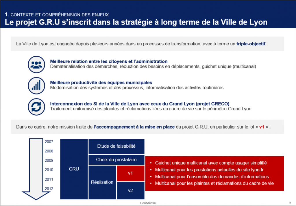
Example of a context slide for a consulting case I did for school, with a bit more than 6 words…
Do Your Slides Rock? Take The Test!
If you’ve ever done consulting work, you know this. However, having a list at hand might help you check important stuff, both in terms of content and form. Especially if you’re an intern there and have to shoot a slide deck every two days! So here’s the list, think about taking a few minutes at some point to look at each of your slides, count your points according to the formula below, and do your adjustments before delivering your deliverable :)
RULES: 15pts for each across-slides item, 1pt for each per-slide item.
TOTAL POINTS: 15 X 6 + NB_SLIDES X 7 = 90 + NB_SLIDES X 7
The Whole Presentation…
Each Slide…
I may add a few more items here and there, but to me these are the main points apart from the most basic, common sense points: prohibit language mistakes, align all elements properly, don’t pick a dumb font, adapt the content to your audience, never use acronyms or specialized terms that you don’t explain somewhere, etc. etc. Of course, if you spot something I forgot, just tell me in a comment below the post and I’ll make sure to add it!
Here are a few other resources that are worth checking out, even though they mostly apply to marketing presentations: Tips For Making Effective PowerPoint Presentations and a Slideshare on how to beautify ugly slides. The last one is worth reading in part because it demonstrates perfectly how easy it is to bullshit your way by making pretty slides when you don’t have actual content to present…
Last but not least, here are the two books you should definitely get if you’re keen on making beautiful and useful PowerPoint presentations: Presentation Secrets by Alexei Kapterev on the one hand, and Slide:ology by N. DUARTE on the other hand. Both these books are simply awesome and will teach you everything you need to know!